Let’s talk about color.
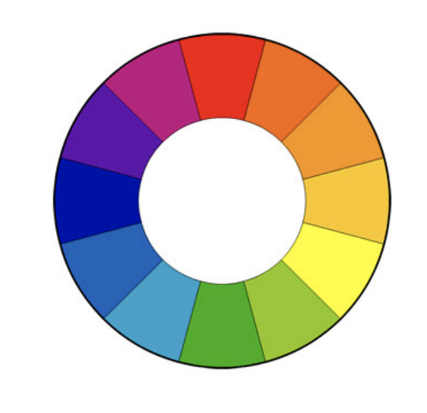
Most of us were introduced to the color wheel early on—ROY G. BIV may still echo in your head. But when it comes to defining your artistic voice, color plays a much deeper and more personal role.
Every color carries associations.
Red evokes passion, power, courage, or even rage.
Blue can feel calming, introspective, or mysterious.
Yellow radiates optimism, memory, or warmth.
But what truly matters is not what the color wheel says—it’s what your experience says.
My friend LynnAnn Agnew, a longtime color design strategist, and I often talk about how color impacts our work. She often reminds me that color is emotional; it’s memory-based; it’s personal. It’s not about your favorite color or what looks best on you. It’s about the moods, stories, and sensations that rise up when you stand before a particular hue.
Ask yourself:
-
Which colors stir something inside you?
-
Do you have specific color memories tied to childhood, seasons, people, or places?
-
Does a certain color show up consistently in your work—and why?
One colleague recently discovered that yellow dominated her paintings because of a cherished childhood ritual: buying a lemon every day, peeling it, salting it, and eating it slowly on her porch. The memory of that bright, joyful ritual continues to shape her creative choices decades later.
This is the power of color. It becomes part of your history—and ultimately part of your artistic voice.
Viewers connect with your work through the emotions you embed in it. When you use colors aligned with your memories, experiences, and inner truth, your work resonates more deeply.
So go beyond primary, secondary, and tertiary colors.
Go beyond the wheel entirely.
Use the colors that feel like you.
Let them communicate your message, shape your vision, and amplify your artistic voice.
Want to Explore Your Artistic Voice Even More?
Color is just one part of creative expression. Discover how to uncover your unique artistic voice in my free 4-day mini-course Finding Your Artistic Voice.
Let me hear from you. What are your color memories? How does color play a role in your creative voice? I’d love for you to join the conversation.
Be well….be creative,
Clare
Learn how photographs, wax, and intuition come together.
View my photo encaustic classes, courses, and workshops.
Color is very important to me…I am always near, close or on the water. Blues and greens play an important part in my work. Our conversations in our Saturday Creative Circle, had me get a color wheel. It makes it easier for me to visualize, blend and create the encaustic wax colors I see in my mind…
Fabulous…..yes, it’s amazing how color is actually a part of us and we don’t even realize it. I totally see how the blues + greens play an important part in your work!
Clare, I’ve been a photog for 50 years, so the RGB color wheel is ingrained in my brain. I use it when I’m styling a session and when I’m making suggestions for tones in clothing to clients. But, maybe I shouldn’t? Should I be using the the physical color wheel of RYG for these visual uses, and reserve the RGB color relationships for the digital world?
Thinking back to the many hundreds of hand colored images I produced back then- should have used RYB?
Al, I have no idea…..I’m more interested in the emotional effect that color has on the artist and how it can be used in our artistic vision. What do certain colors mean to you? What colors are you drawn to? and why?
In my opinion, those are the questions you should be asking.
“Know and use the colors that have become part of who you are. Use color as a tool to communicate your art. Let it become part of your artistic vision and your voice.”
I always think that color is like music. Both go straight past our verbal brains and land directly as feeling. The feeling can be from memory but sometimes I would suggest the feelings are spiritual or mystical, connecting us to the whole of life.
There are two colors in my oil stick box I practically salivate over, celadon green and olive yellow. The first is the color of sage, predominant in Eastern Oregon where I grew up and in New Mexico where I live now. The olive yellow is the color of lichen on boulders and boat dock wood and the cedar waxwing.
I used to live among the Navajos and came to believe as they did that turquoise has healing strength. I only have to think of it to feel that strength.
In my photography I often use sepia or Polaroid green filters to suggest memory. These colors work so well with the yellow wax I like to use, like a yellowed photograph you find in an old box.
I could think about color all day. Thanks Clare for giving me something to think about during these long days.
Thanks Carol. Everything you said is exactly right. And your images show it perfectly.
My mother’s favorite color was turquoise, any shade of turquoise. When I started doing art I noticed that I gravitated to using turquoise in almost every piece no matter the amount. It might be just a dab of brush stroke, but it could also be my major color. It evokes a strong comforting emotion to me plus some very vivid memories.
What a lovely memory and special to add it to your pieces:)